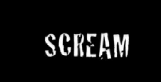
I have chosen these 3 opening credits
because, I like the font and simple colour choices of the scream one.
Because when our killer kills someone he uses a knife and with the scream
opening credits, the font looks like a knife has sliced through the text.

Additionally, I have the Halloween
opening credits because, I like the fact they have used a significant logo to
show what the film is. The pumpkin is very memorable and I like how it gives
the audience a clue of what the film is going to be about. Also the colour and
font of the text is good because the red shows danger and the text is simple
and not to complicated.

Finally I have chosen to look at trick or
treat because, the text colouring is good again with the significant red, it
shows danger and makes the audience start to feel the tension building. Also I
like how it’s not like an average opening credit; I like how it shows different
scenes and scary pictures.
Overall, I have decided to merge all three opening credits
together. I am going to plan to use the font from the scream opening credit
because it looks like a knife has cut it. I want to use red as a text colour
because it shows death and danger. But finally I am going to use small pictures
to make the film memorable. So I have taken my case studies of Trick or Treat, Halloween
and Scream, and I have chosen to use small parts of all their credits.
No comments:
Post a Comment